3 actionable tips to instantly improve your home's lighting
If you've been in Berlin long enough, you know how the darkness of winter can drag you into a depressing mood. With this moody spring, it feels quite unstable too.
My solution: Create great lighting at home. Ok, it won't solve everything, but you'll be halfway there!
I personally hate spots. They create harsh shadows, they're aggressive, and they bring nothing interesting to your ceiling. It's usually one of the first things I remove at clients'.
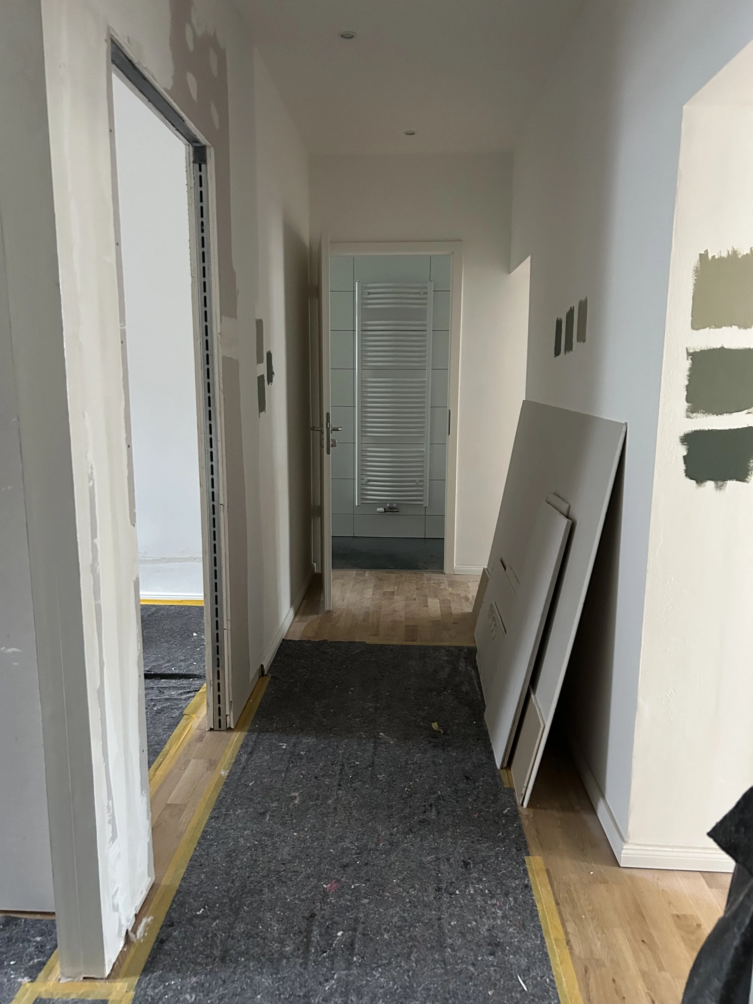
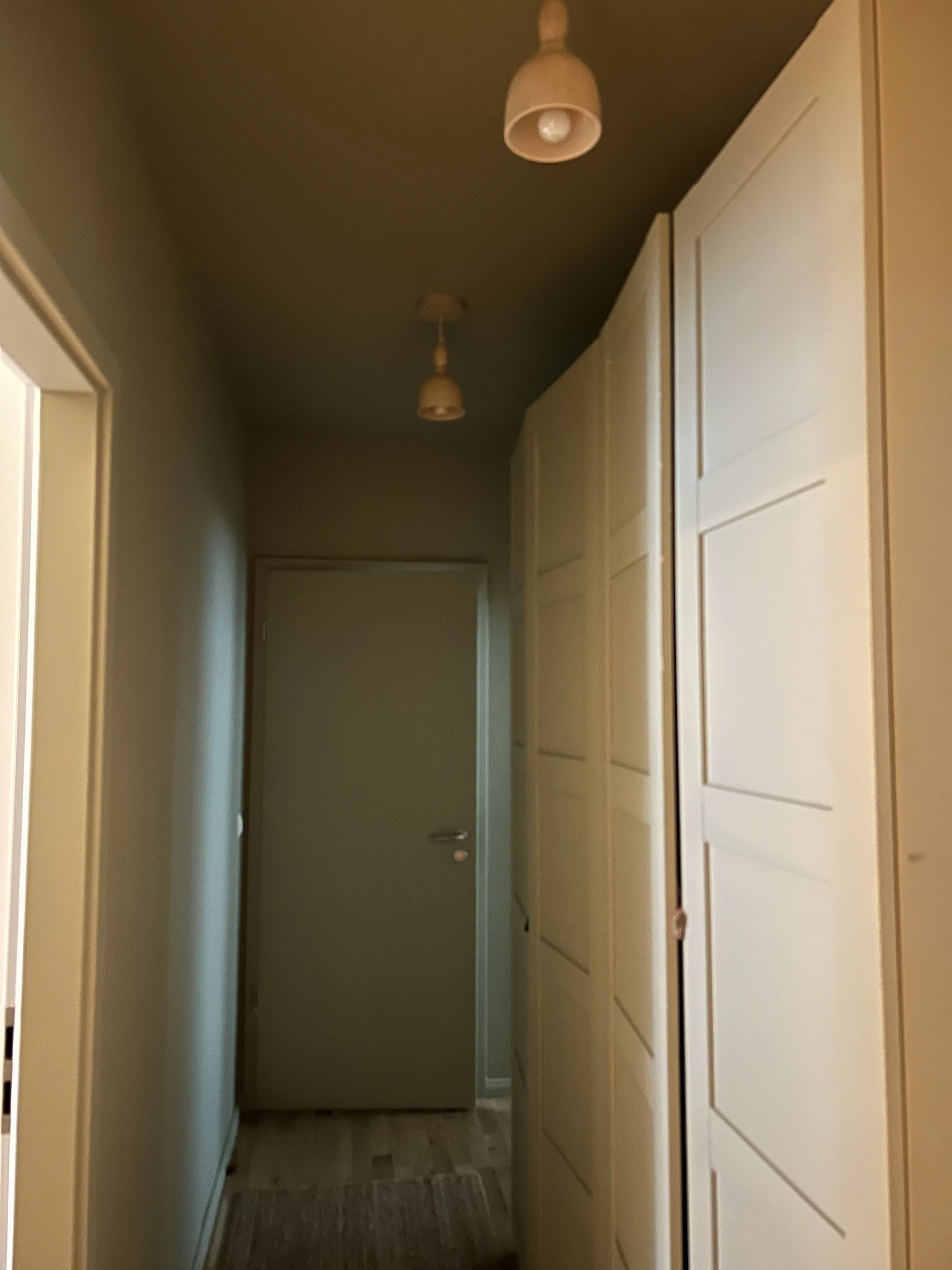
Below is a before/after of a hallway painted in one of my favourite greens, with and without spots. On top of making better lighting, pendant lights draw the eye upward. You'll walk into a hallway, preferably a colourful one if you work with me, and the shape and colour of the pendant will catch your attention straight away.
If you want to start with a few basics to improve your lighting, here are my top 3 actionable tips:
#1 Forget your ceiling lamp
When I visit my parents, it drives me mad that they only use the ceiling lamp. Luckily they don't read this blog haha. A single ceiling light flattens the room, it's like standing under midday sun without sunglasses. Start using floor lampsand table lamps and you'll immediately notice a difference in how the room glows.
#2 The rule of three
Three is a magic number in interior design. Just like you'd arrange decorative objects in groups of three rather than two, you'll create great lighting by combining three different light sources in a room. Ideally at different heights, so the light balances the shadows: one floor lamp in a corner, one table lamp on a sideboard, one on a side table. That creates what we call a triangle of light, warm, balanced, and never harsh.
Speaking of triangles: in interior design we also think in three types of light. Ambient lighting is the general glow of a room. Task lighting is the functional light, above your kitchen counter, your desk, your reading chair. And accent lighting is the most fun: it highlights a piece of art, a plant, a texture on the wall. Most homes only have one type of lighting. Try to integrate at least two of them.
#3 The Kelvin number: 2,700K
Every lightbulb has a colour temperature measured in Kelvin. The lower the number, the warmer and more golden the light. The higher, the cooler and more clinical it gets.
2,700K is the sweet spot. It's close to candlelight, warm, flattering, and cosy. Anything above 3,000K starts to feel like a hospital corridor. Next time you buy a bulb, check the packaging. It will say "warm white" and the Kelvin number. Ignore everything above 2,700K.
To give you a sense of the scale:
2,200K is very warm, almost amber, great for a bedroom or dining room.
2,700K is the gold standard for living spaces.
3,000K is still acceptable in a kitchen.
From 4,000K upwards, leave it for the office.
PS: If you are feeling overwhelmed by all the interior options and just want someone to create a coherent concept, make the right selections for your lifestyle and budget, and do the sourcing for you, that's exactly what I help with. Book a free 15-min call here and let's talk about your space.